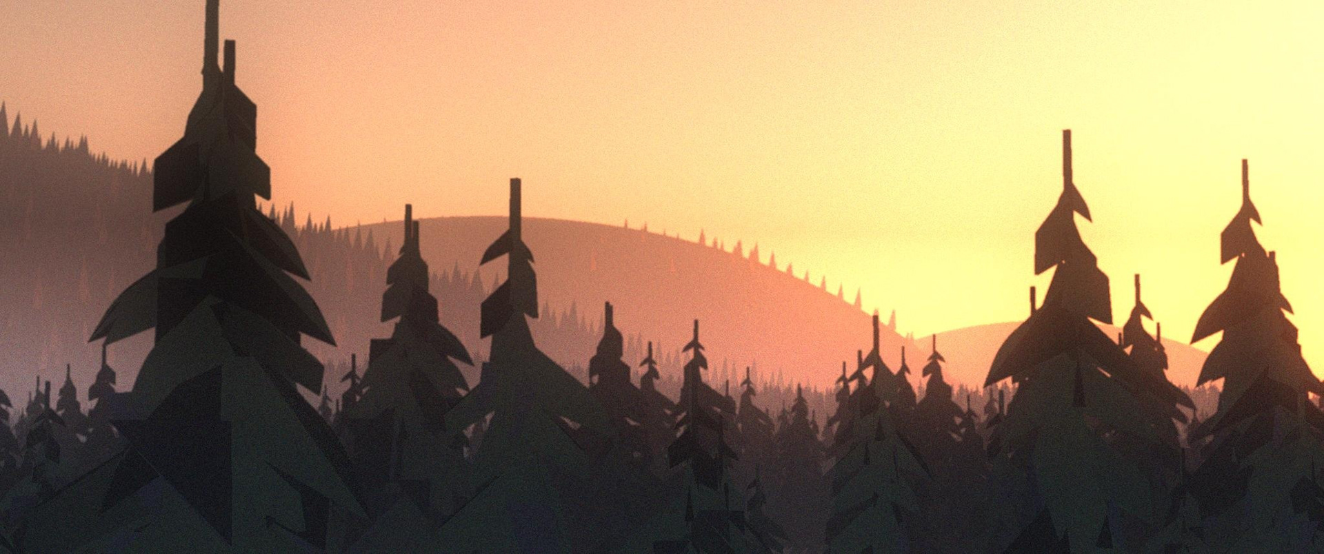
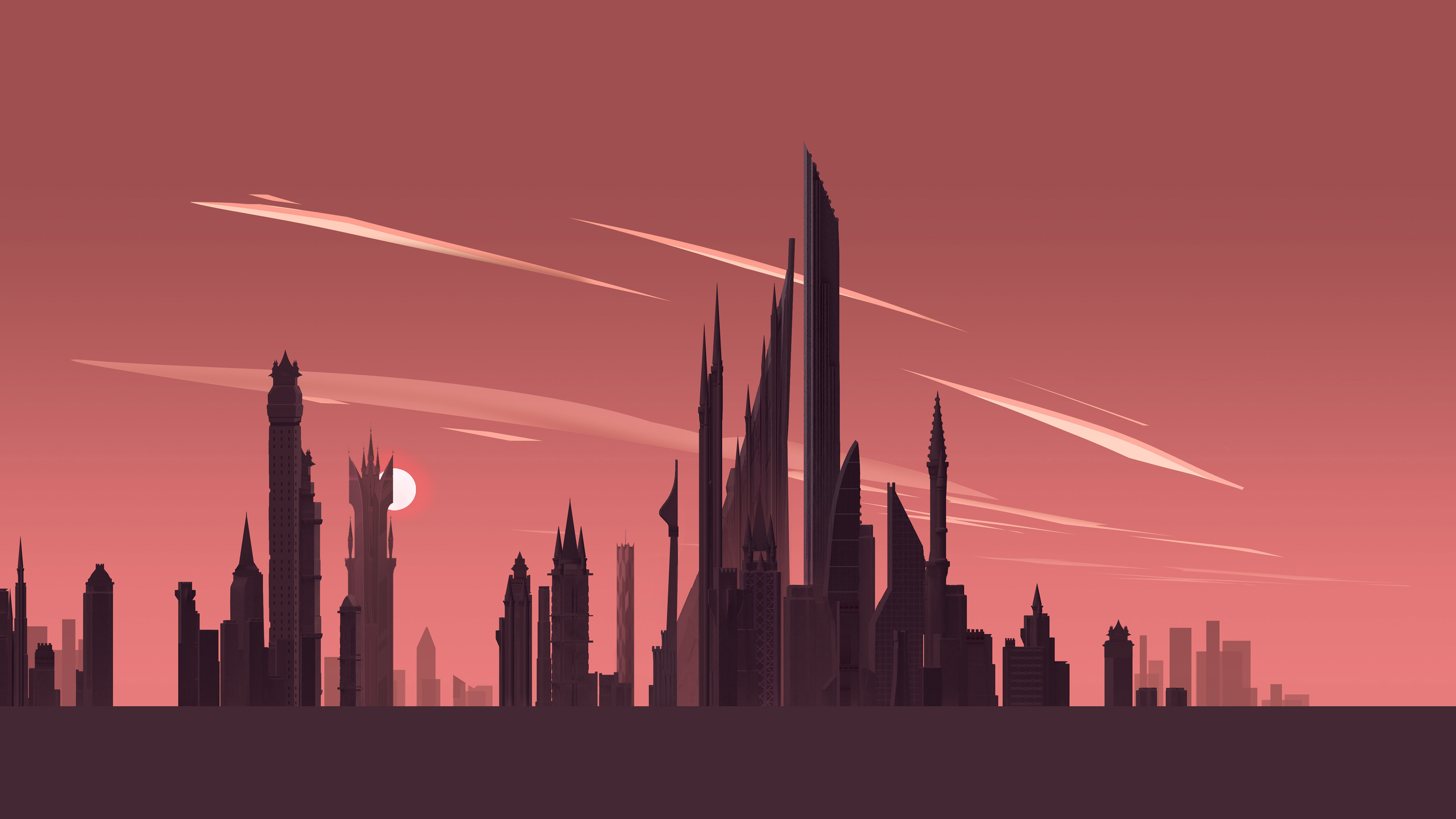
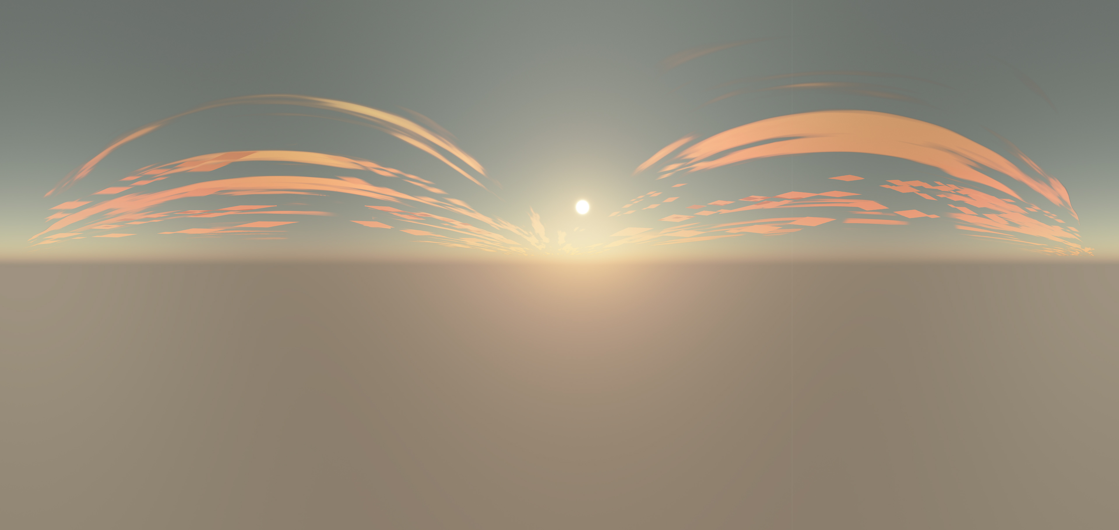
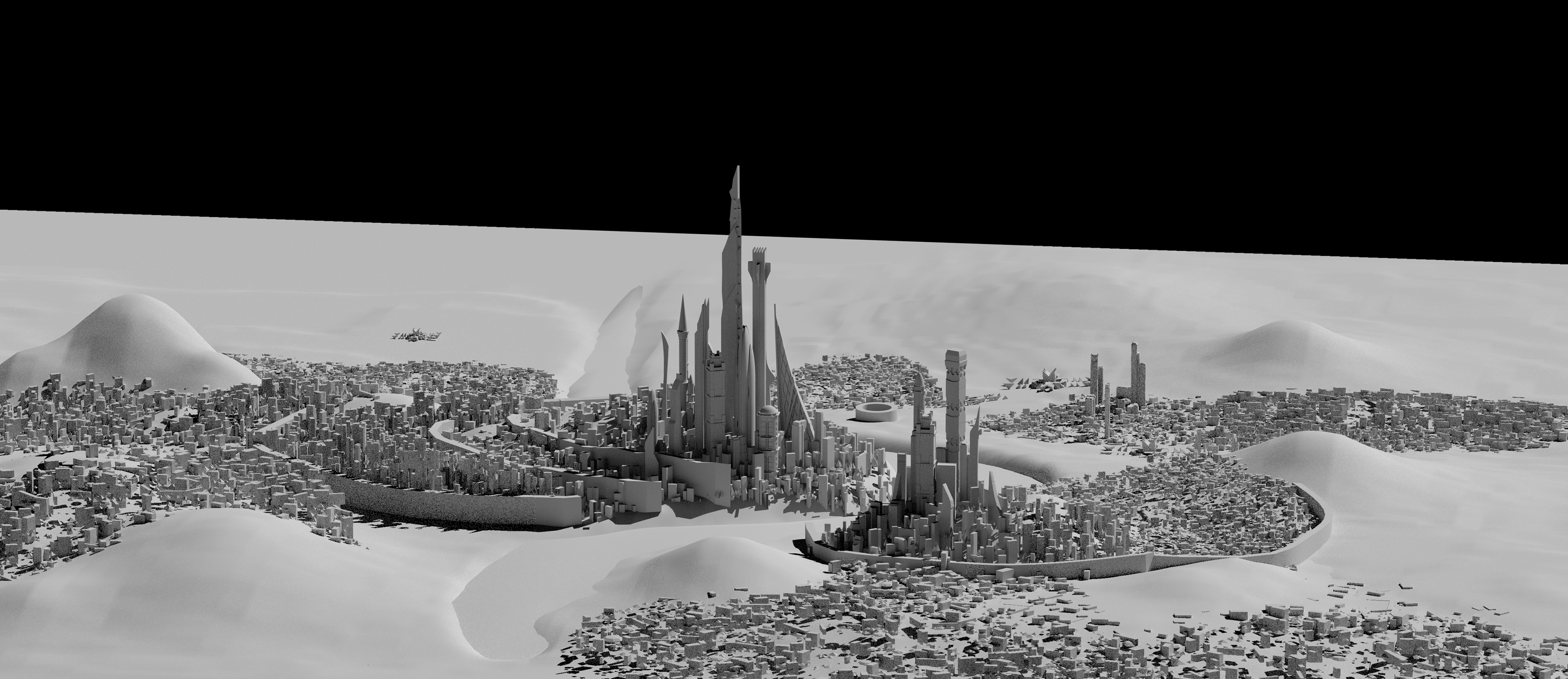
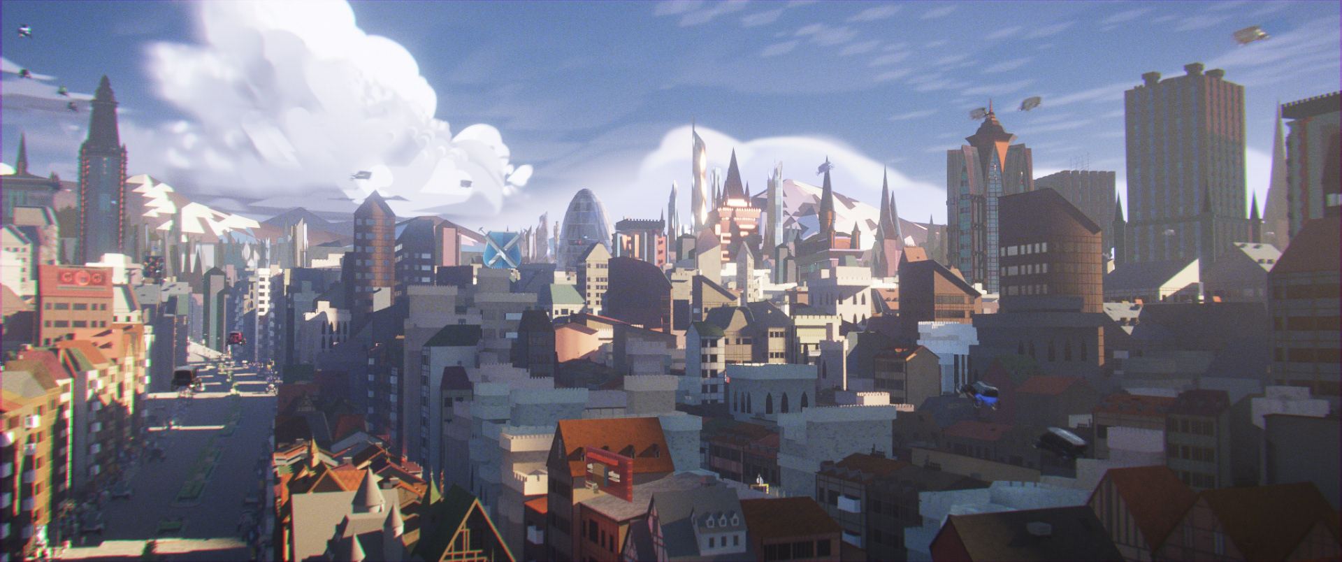
I created the cityscape, animated BG traffic, pine-covered hills, and sky using a mix of digital illustration, 3d modeling + texture, lighting, rendering, and compositing for this early, vision-defining piece
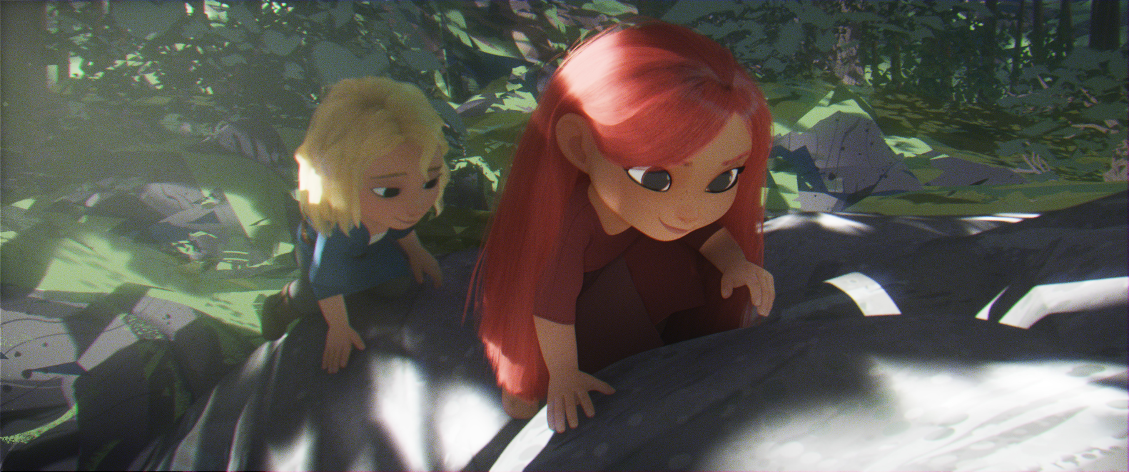
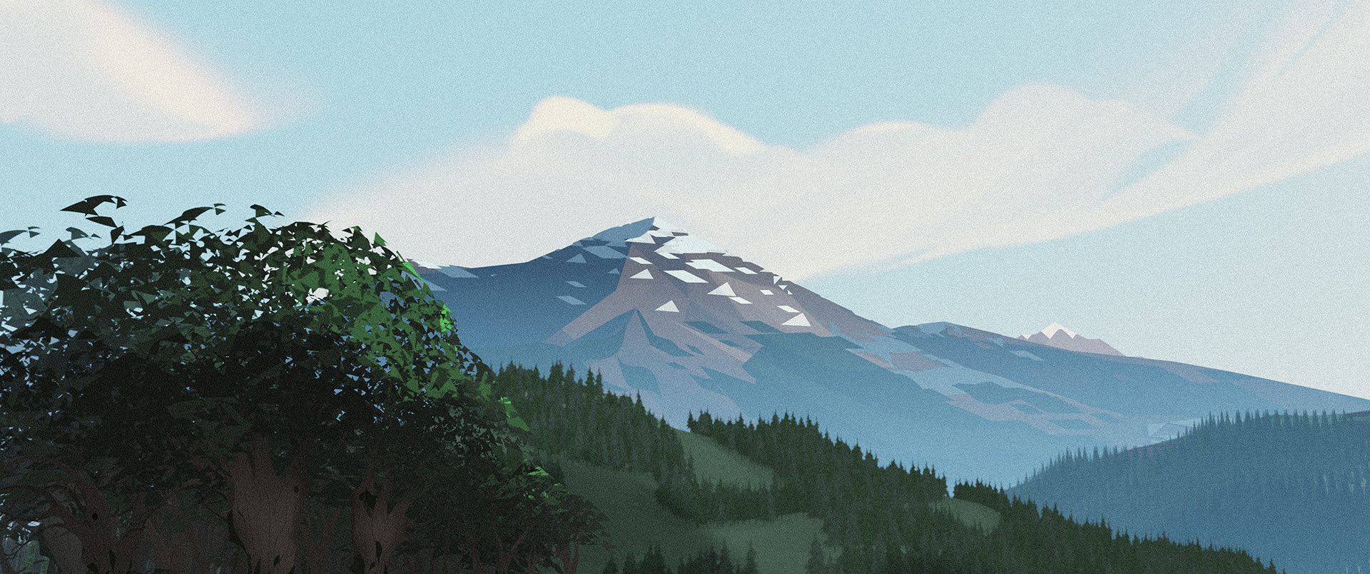
Rendered Images in front with animated bg hybrid (environment featuring both modeled, rendered, and painted elements) behind that shows a project feature: gradual shift by distance into pure illustration
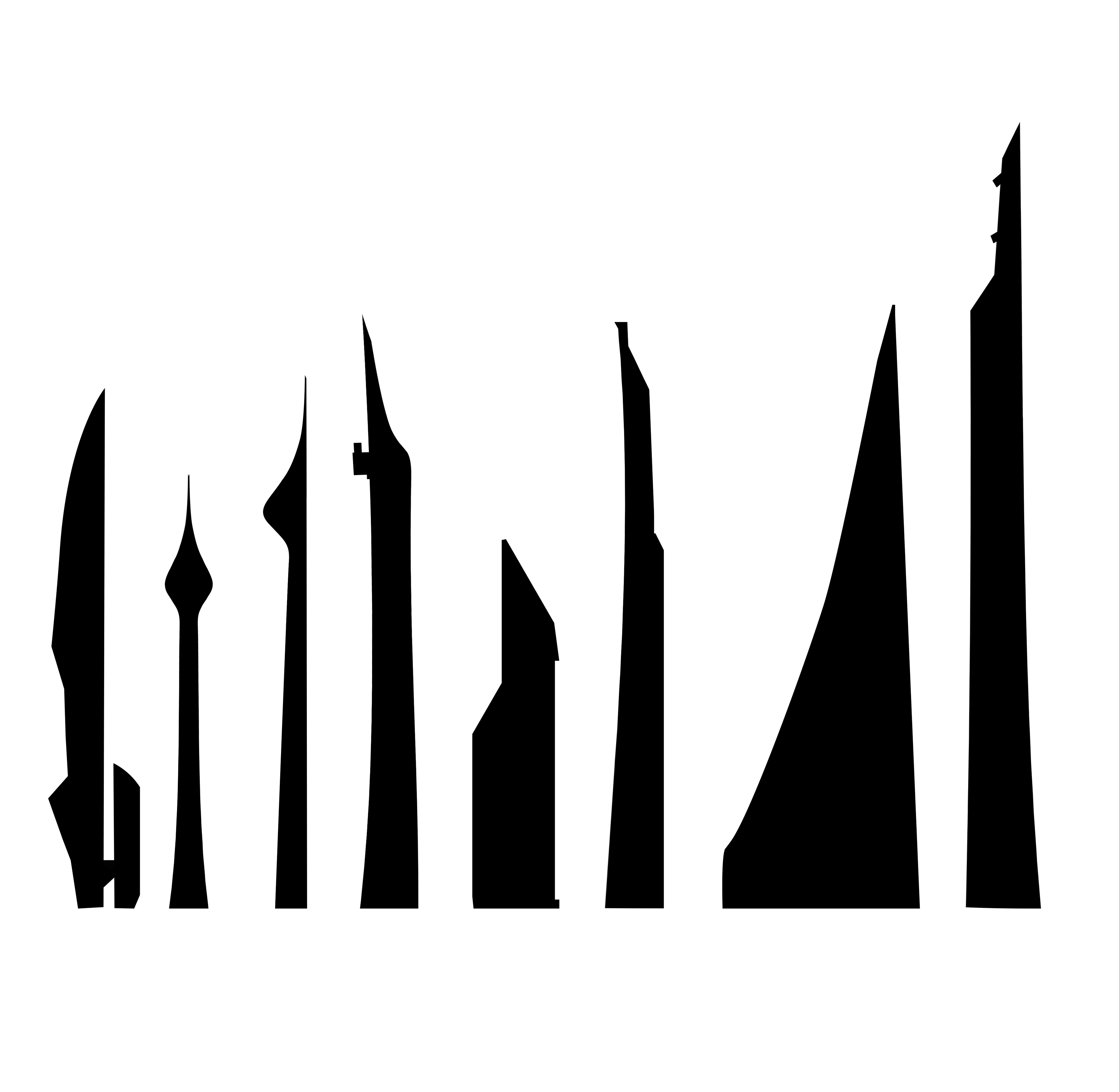
Study - change silhouette and retain core characteristics
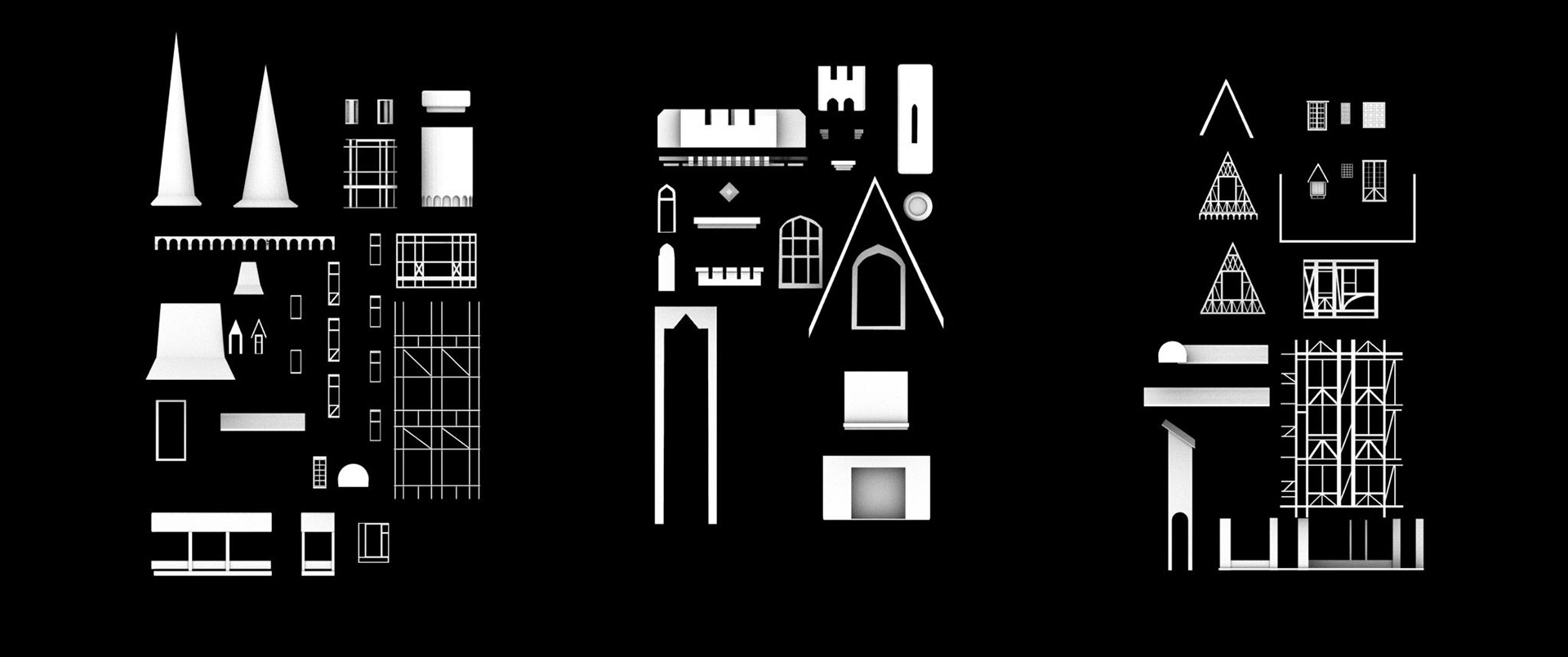
Level of Style 2 high-rise exploration showing graphic textures to imply detail for windows, floors, etc. This sheet features original designs and designs adapted from other team members
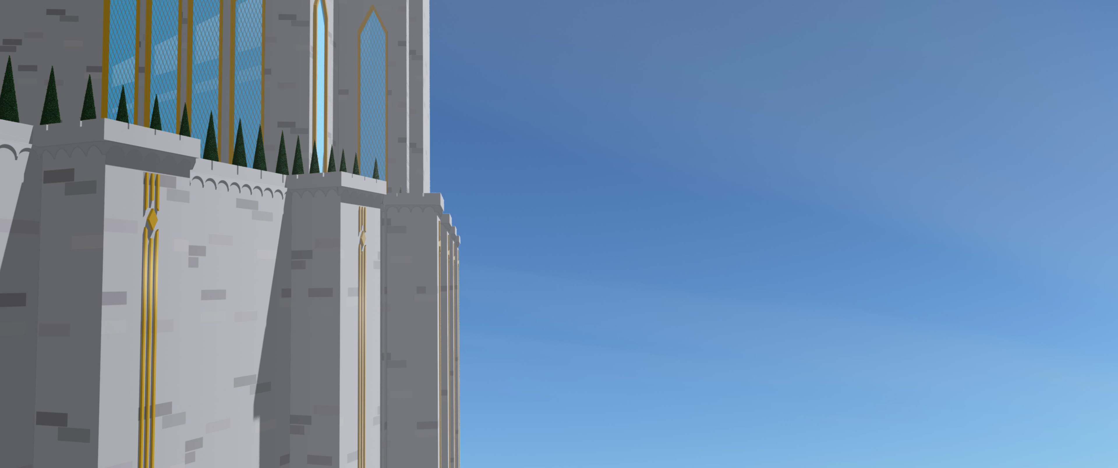
In-Progress BG Environment that features many of style hallmarks: abstraction for implied detail, large graphic shapes, and strong medieval silhouettes through a long lens (300mm).
Hand-painted building swatches to give both a graphical and bespoke quality. Imperfections added to the impression of an illustrated world.
Distant traffic was boiled down to the most graphic elements - dots
A daytime exploration mixing between graphic 3D to hand painted abstract BG
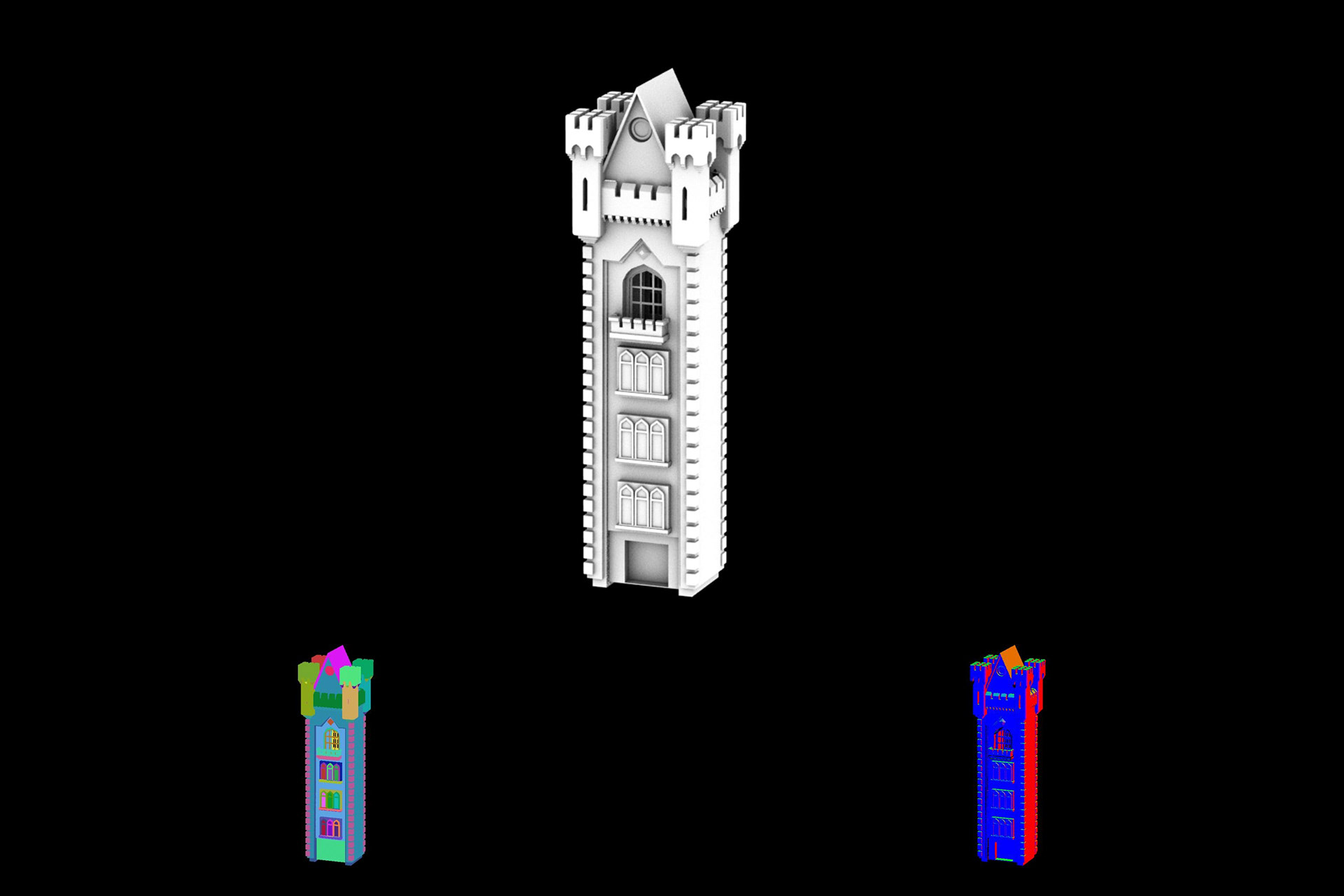
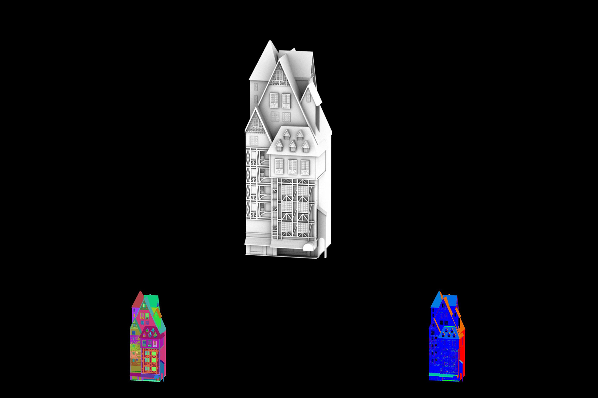
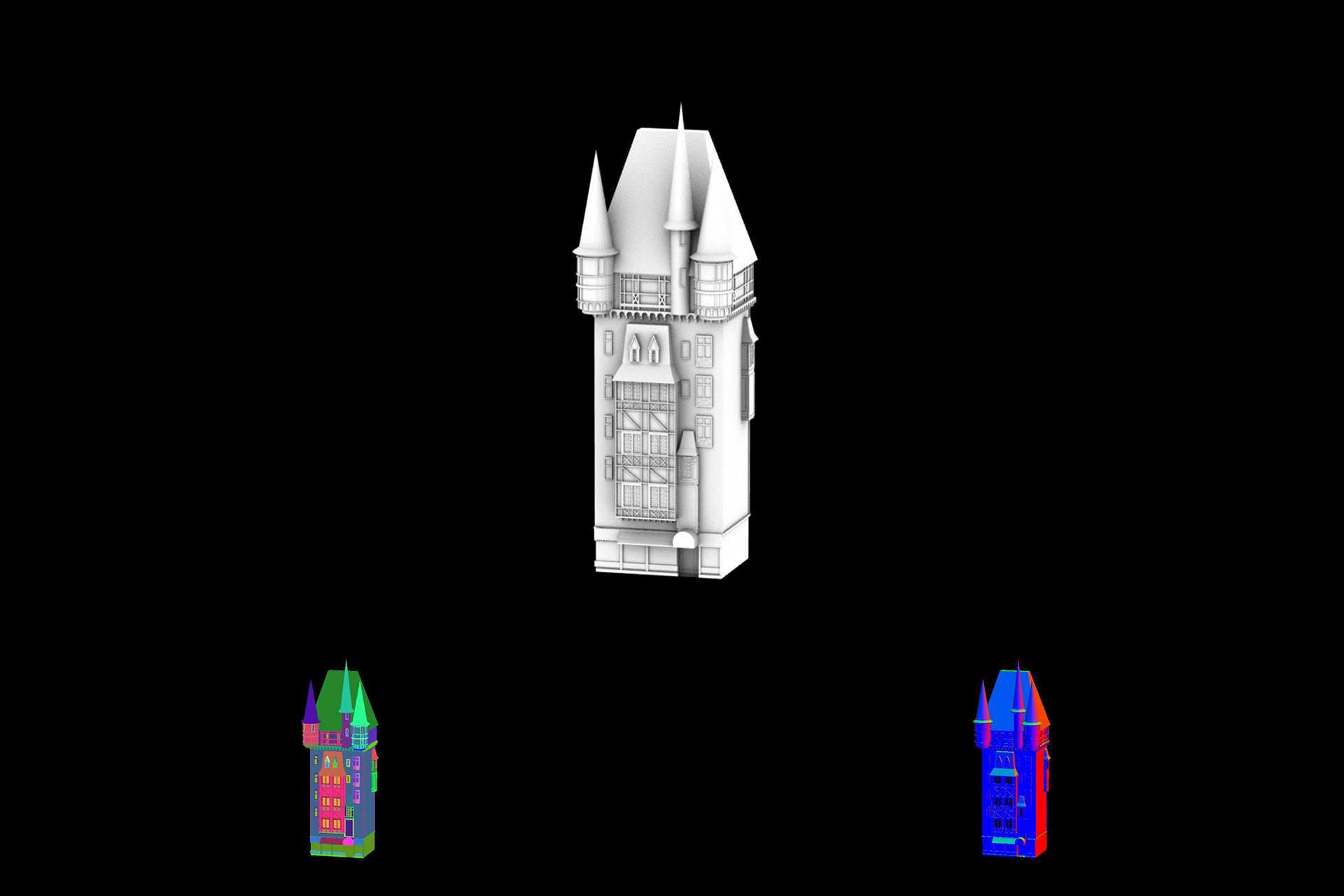
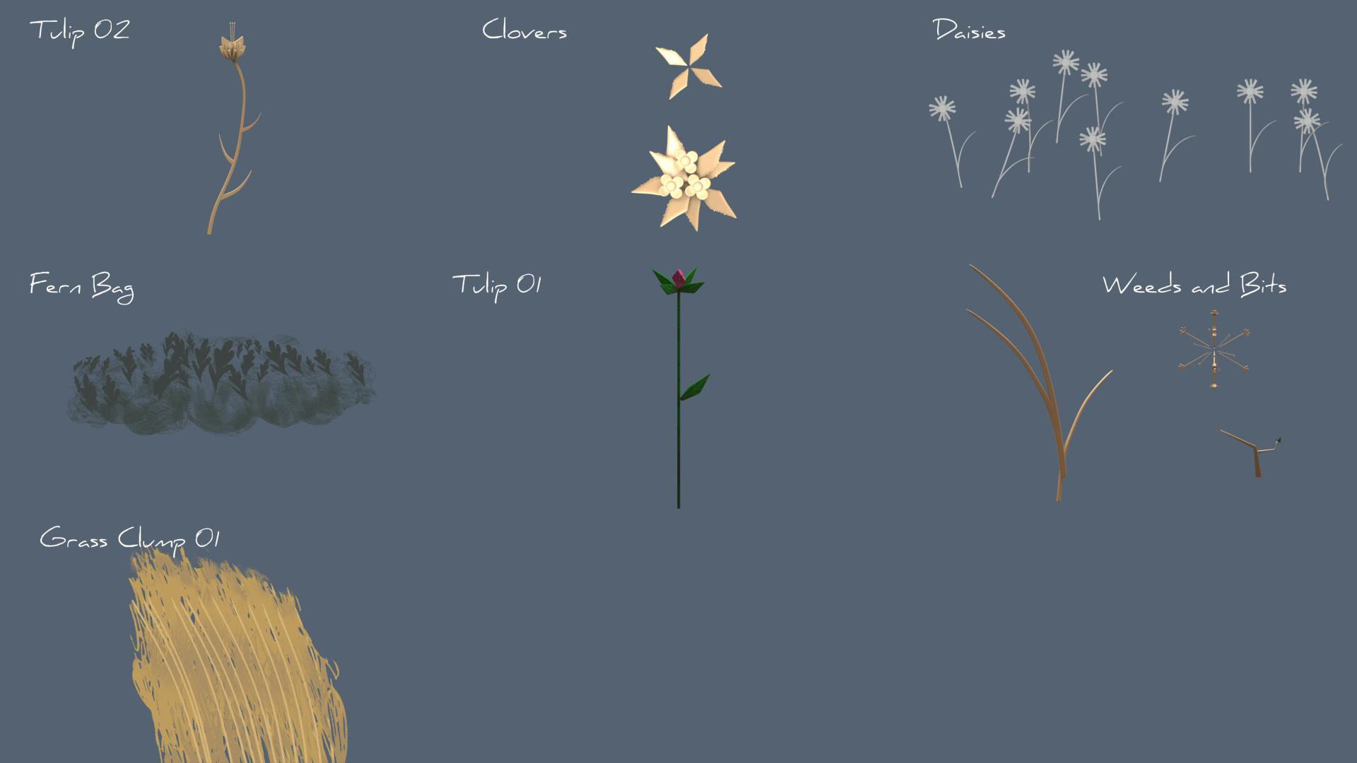
Developing in 3D as well as 2D. Many of these models would eventurally go onto play a role in the Set Extension team's re-usable illustrations and 3D environments.
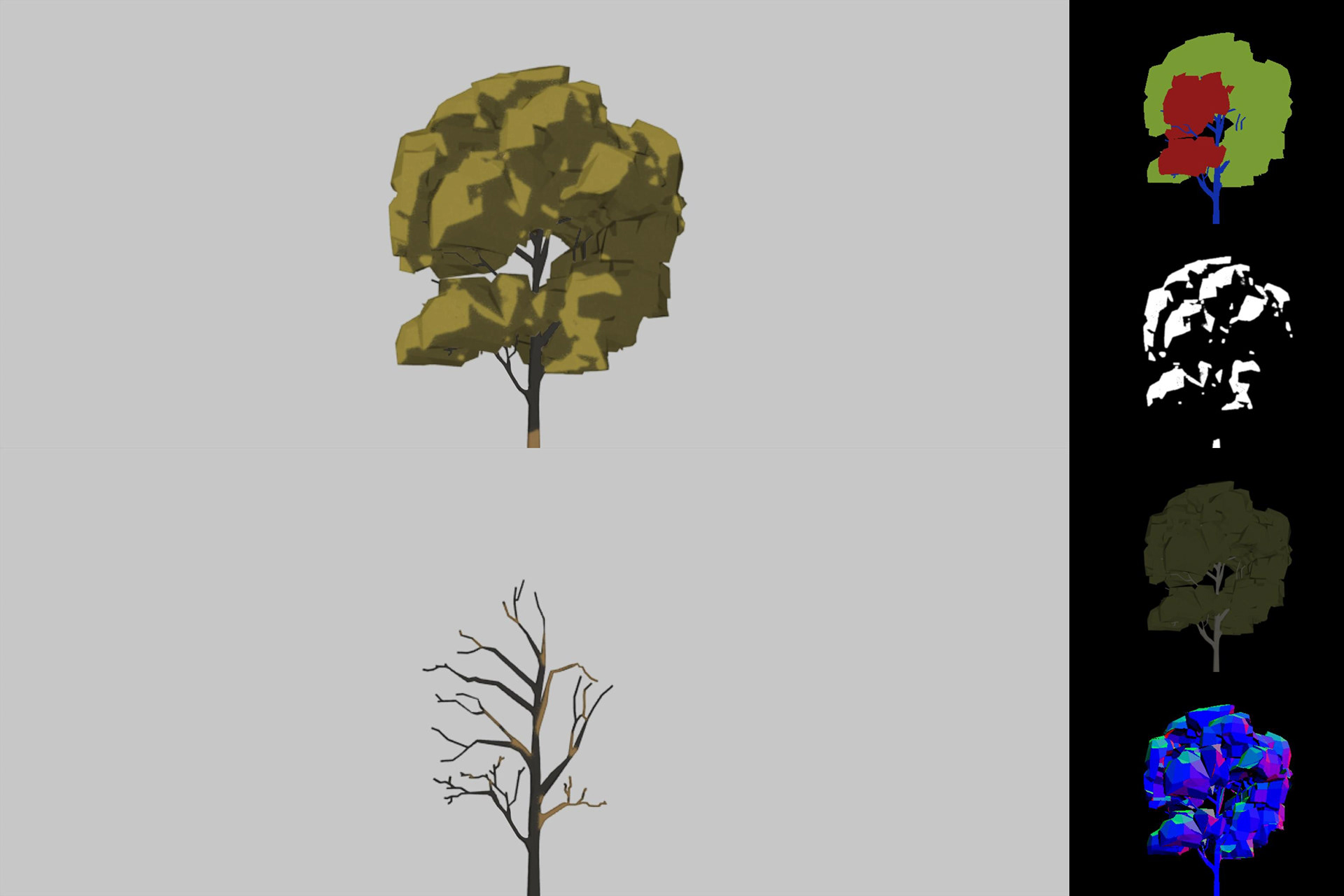
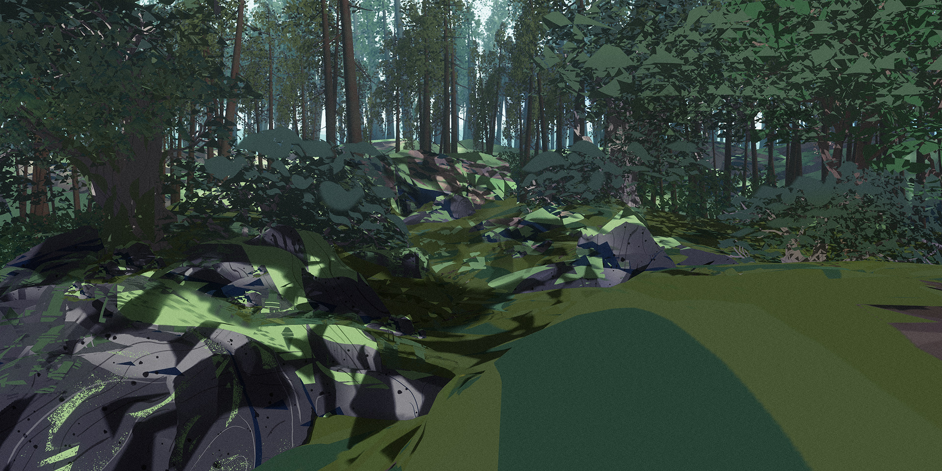
Exploration on keeping energy, imperfection and gesture in 3D when trying for an illustrated look. Stripping out small noisy details like twigs or attaching berries to stems to see if people would visually fill in the gaps. Light is purely "additive", allowing local texture to carry the weight.
I sculpted, textured, lit, and rendered this study on based on a design from Katy Wu into an early tutorial for the Modeling, Texturing, and Lighting Teams. I tried to not just present philosophy, but also a potential recipe to show how to achieve the results.
A stylized bathroom. My mom is proud of this one.
A stylized 3D bathroom. Magic.
